–
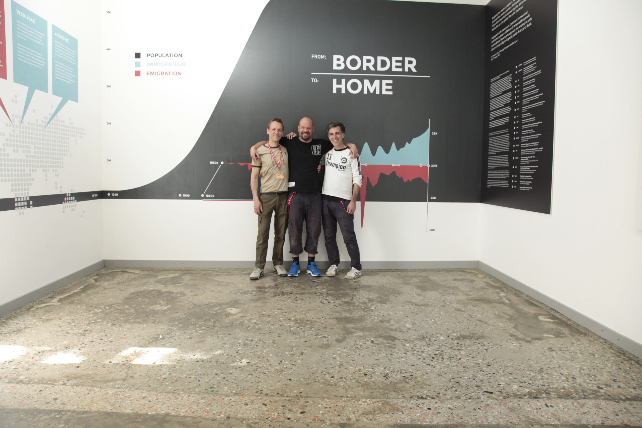
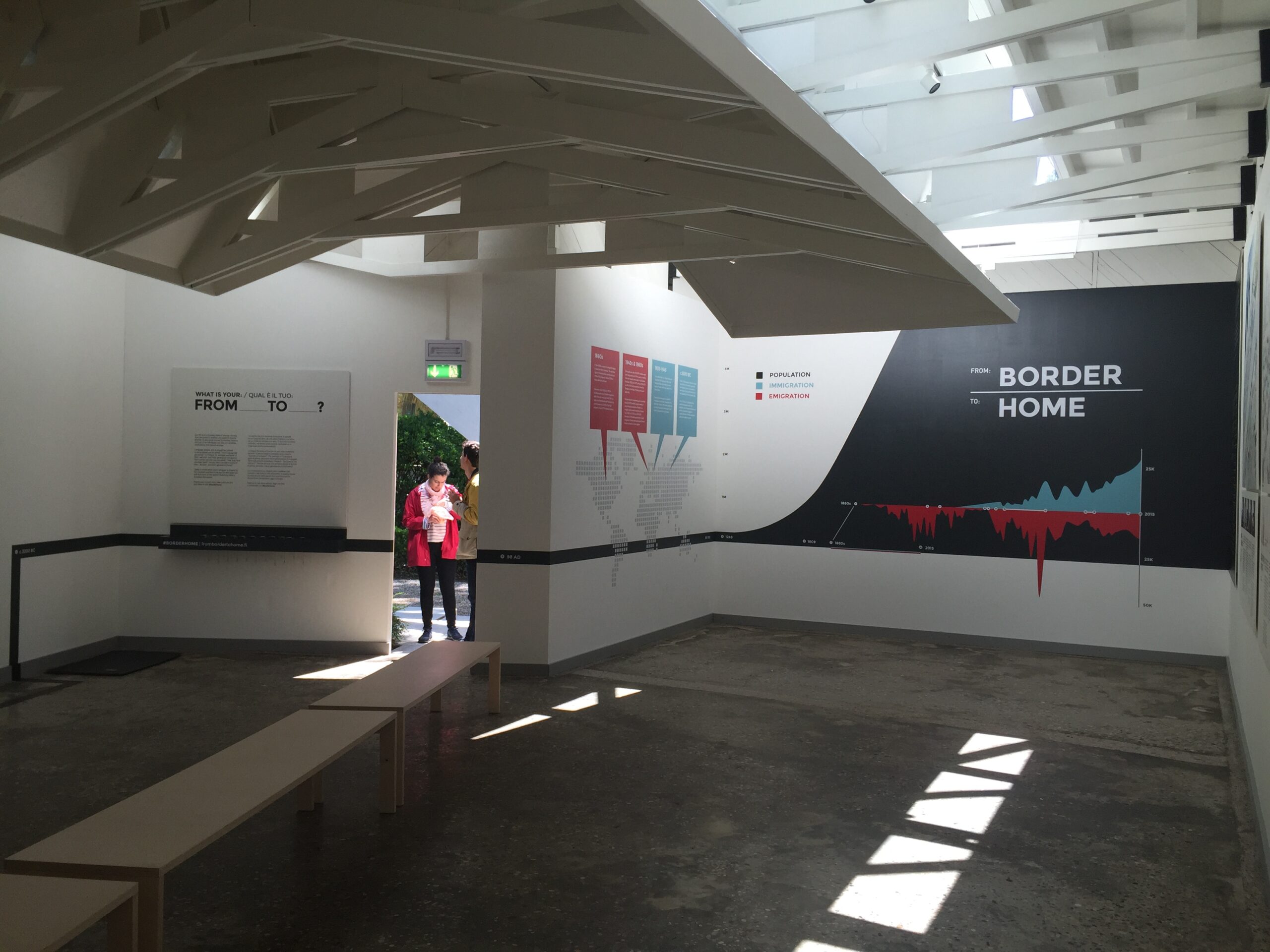
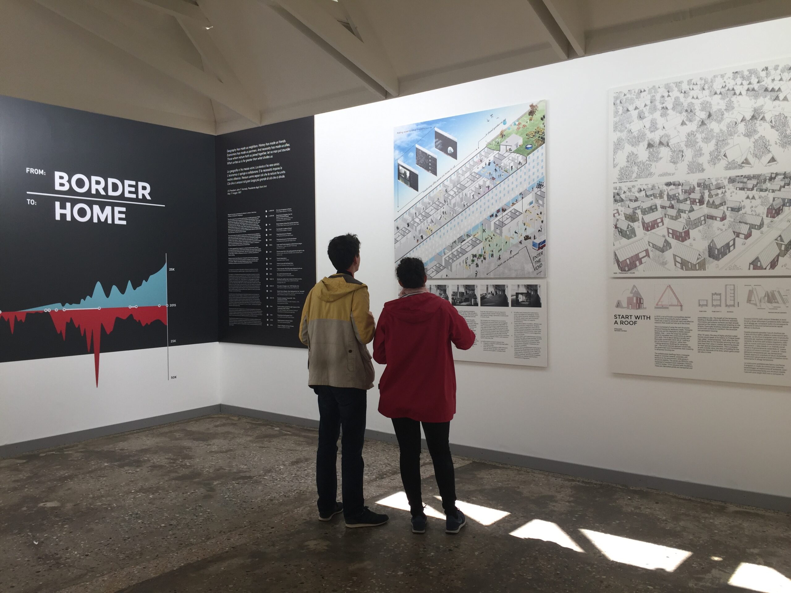
From Border to Home
Finnish Pavilion exhibition concept design
- at: 15th International Architecture Exhibition, La Biennale di Venezia
- by: Marco Steingberg & Tuomo Tammenpää
- for: Museum of Finnish Architecture
- in: 2016
(Journal entry from the project blog: frombordertohome.fi)
‘March 3rd, 2016. I was staring at the wording of “From Border to Home”, the title of the concept brief that curator Marco Steinberg had just presented. The name was the same as the architectural competition from the previous autumn, which was asking for housing solutions for asylum seekers in Finland. The name was great for that challenge, but Marco had just expanded the theme to include the history of migration in Finland: how all of us have a direct connection to migration, frequently no more than a few a generations from either having arrived or left for somewhere. This contextualization together with the awarded entries would be exhibited in Finnish Pavilion in few months. Could it still be titled under From Border to Home?
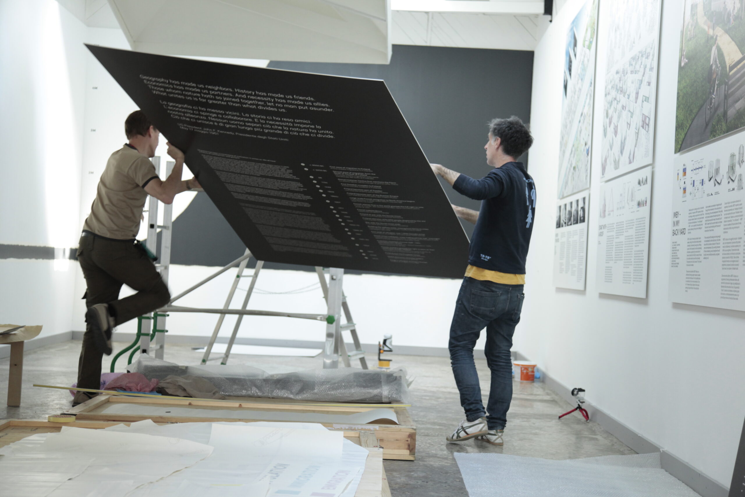
This is how concept design often seems to start. Questioning sometimes the obvious, challenging, and trying to bring clarity to the task at hand, before any actual design work had been done. We had a big team involved in the design, SITO for the exhibition design, and a sizable team from the Museum of Finnish Architecture lead by its director and commissioner of the Finnish pavilion Juulia Kauste.
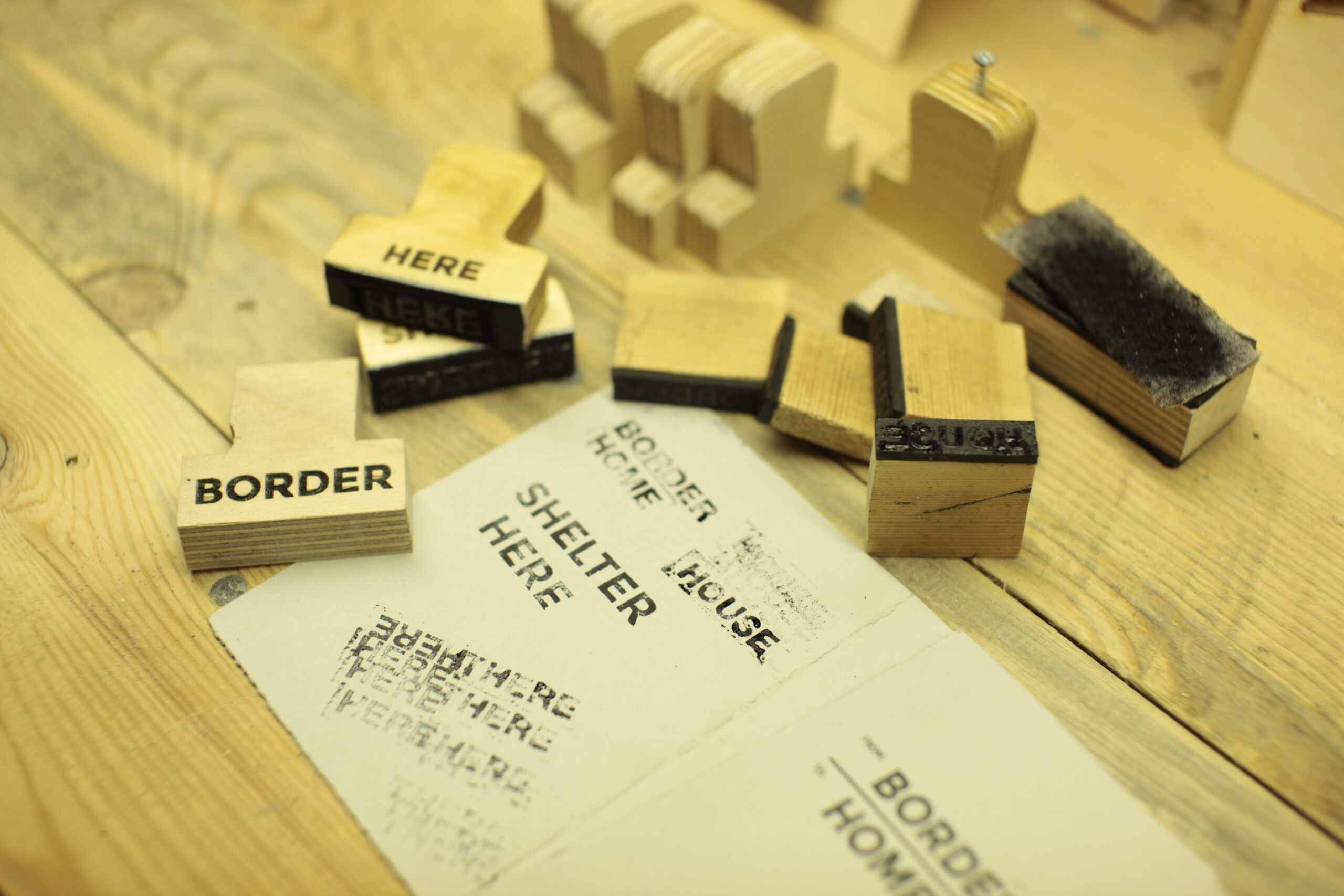
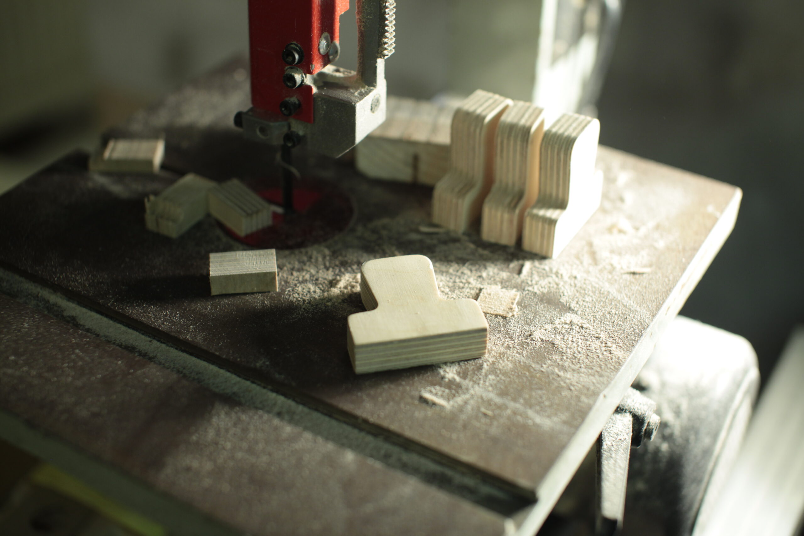
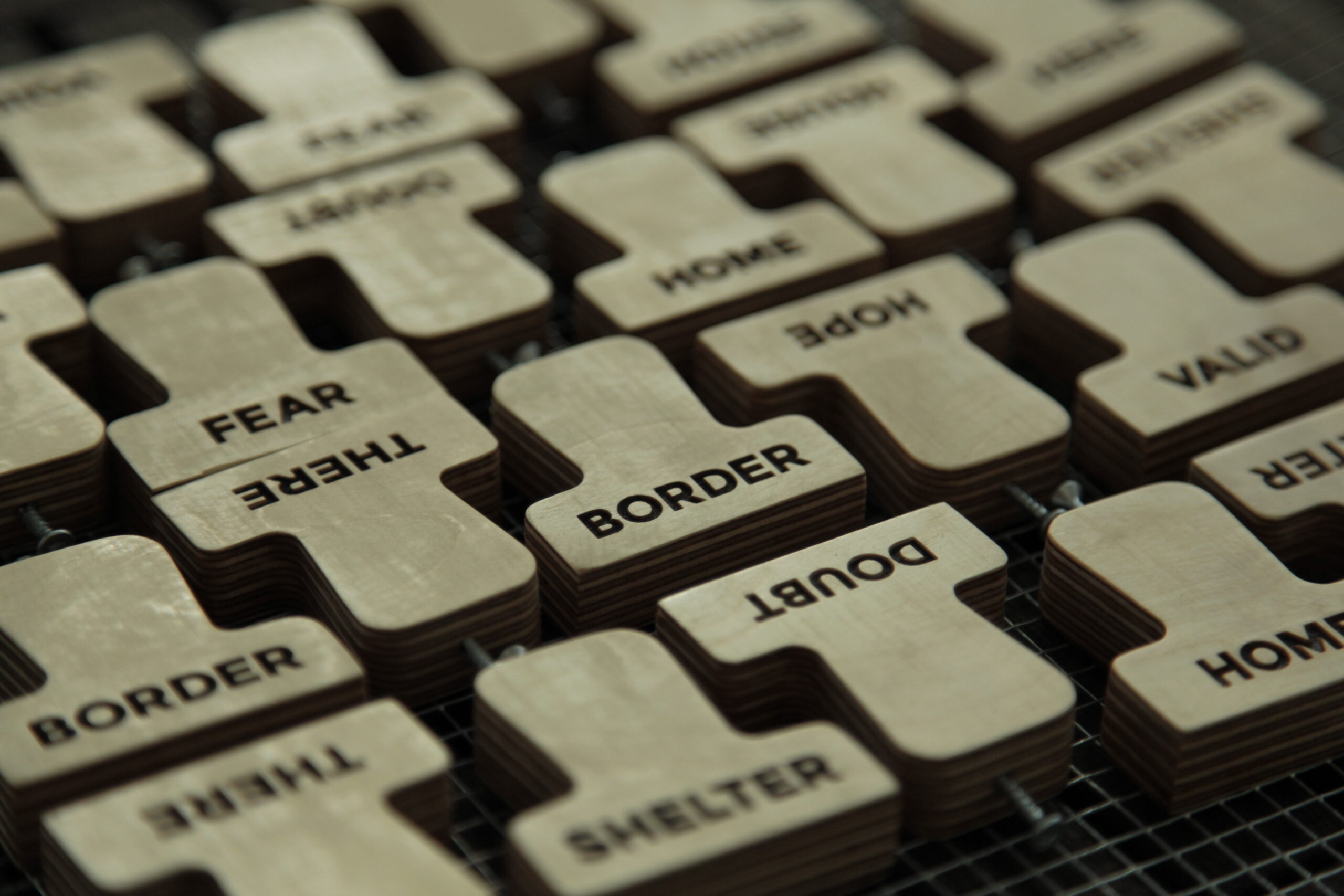
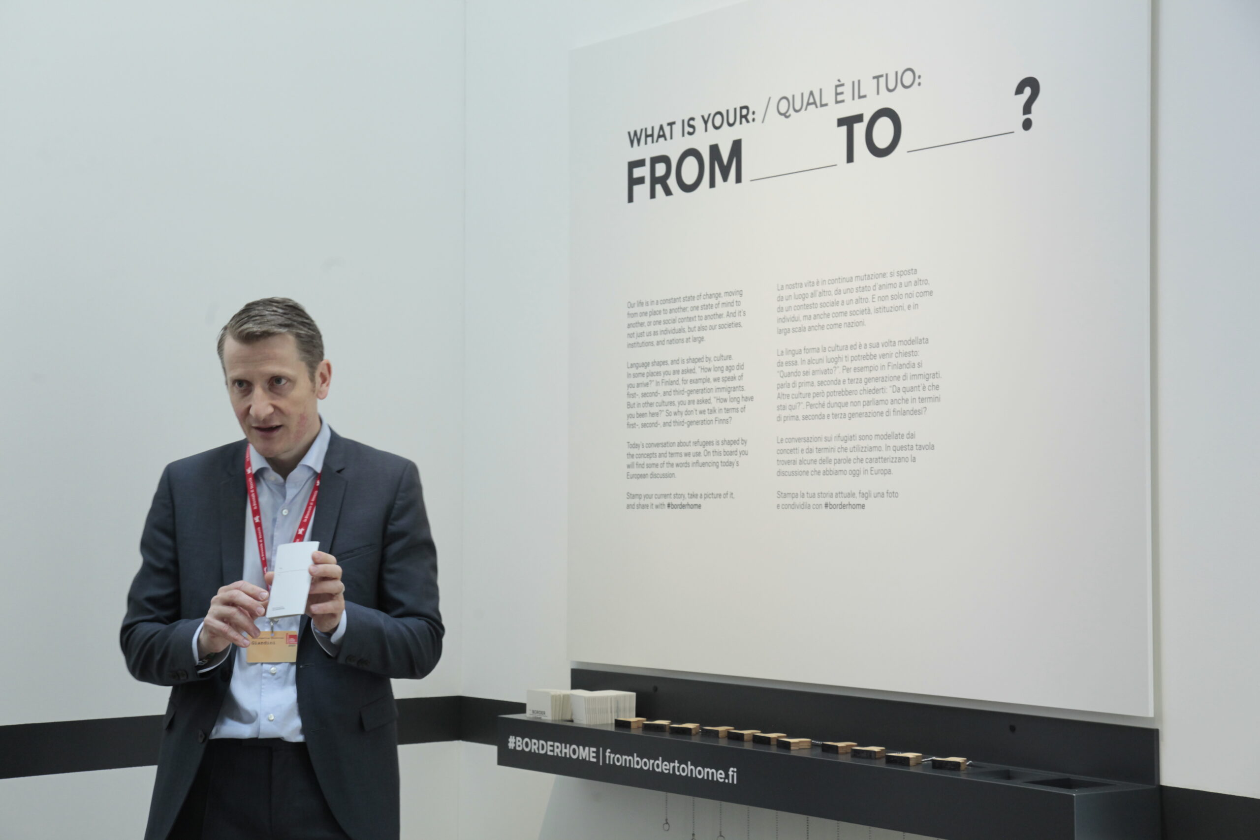
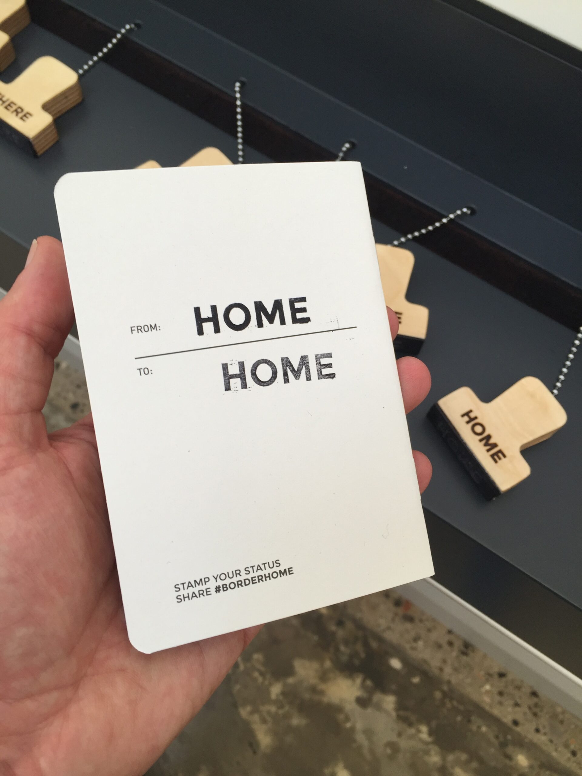
A few days later I presented illustrations of how the title could be expanded. First I included a couple of other From and To words to the title, in a form of a selection, adding words like Here and There or Shelter and Home besides the original words of Border and Home. I visualized this with stamped words, as a reference to stamping as a formal approval (or denial) on your visa or passport. This we discussed with the whole team. The visual language of stamps was interesting but a bit messy, including a set of words in the title was a bit impractical — how would you write it in a sentence … back to the drawing board.
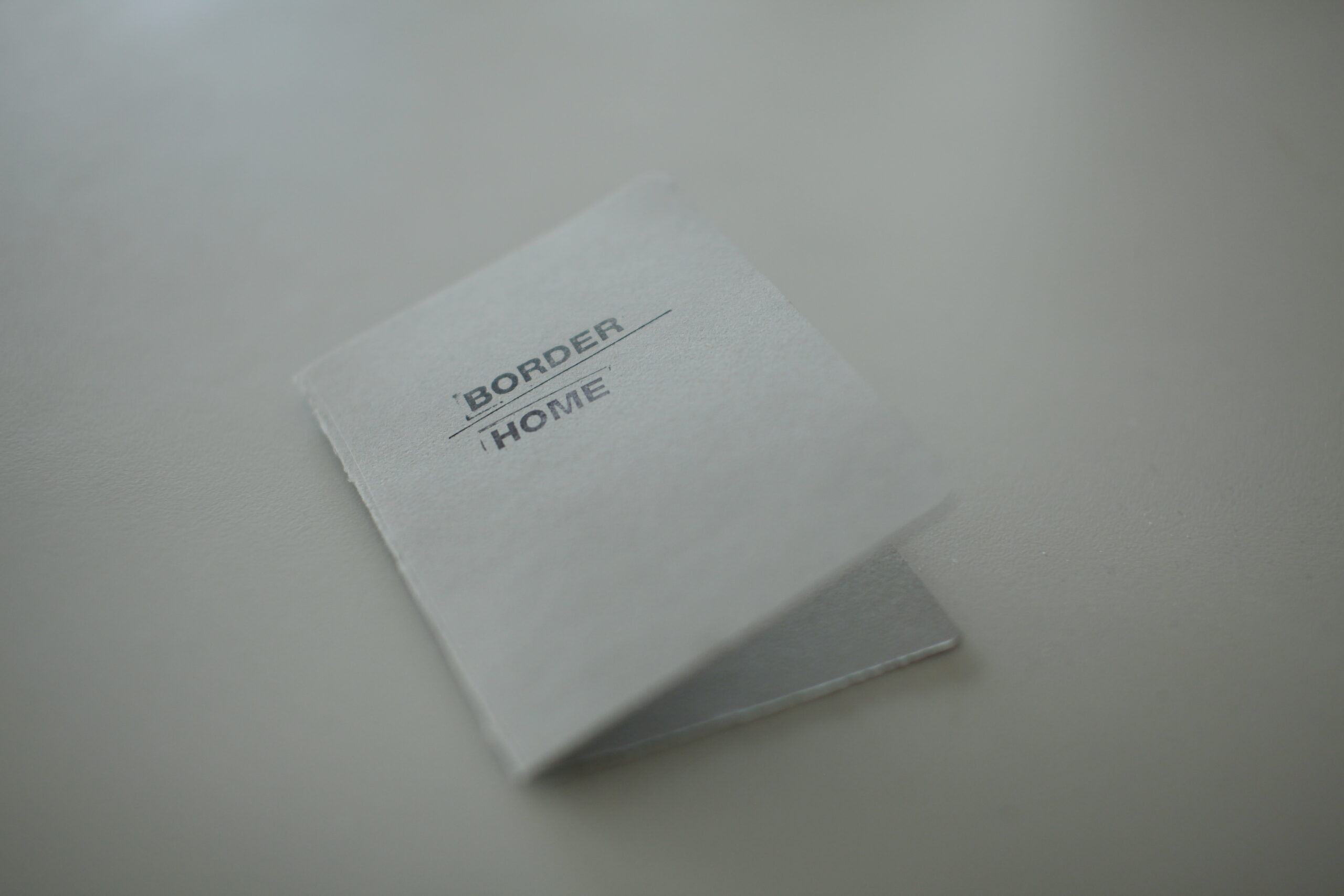
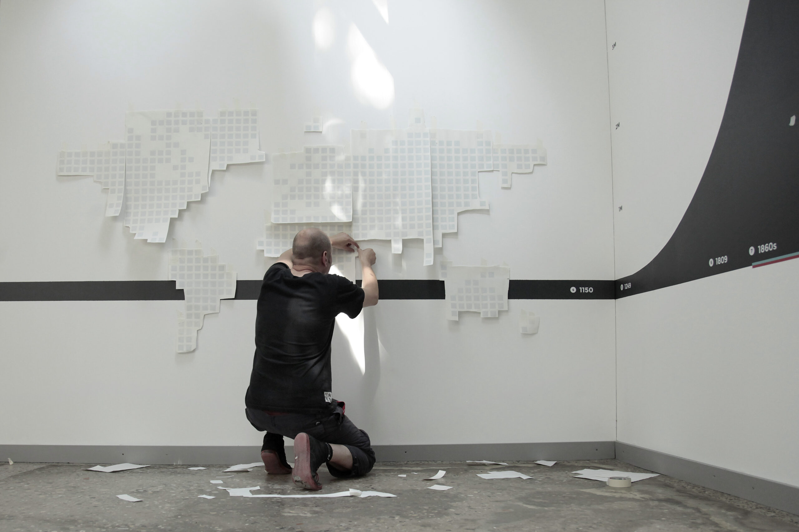
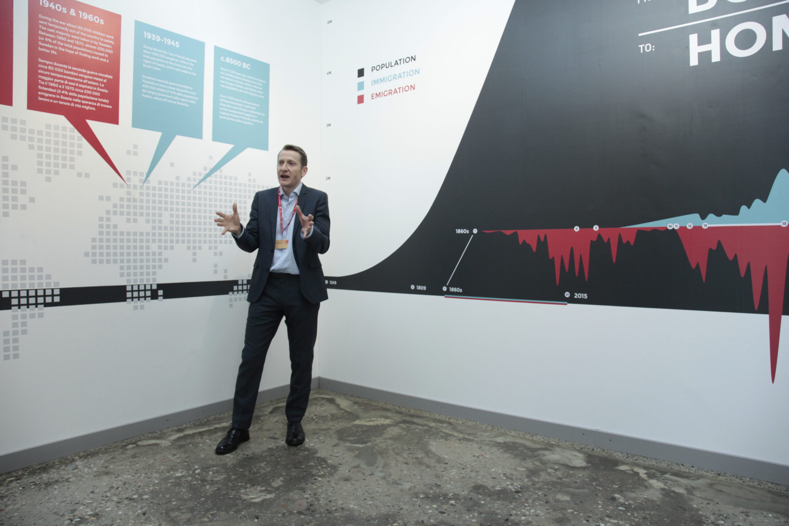
I did a second round of iteration where I cleaned it all up brought it back to basics: visually separating the From and To from the words Border and Home as a small reference to the fact that could be changeable. I saved the use of stamps for later and kept the typography official in spirit (or even dry) to support another visual component of the exhibition: infographics which were to illustrate the population and migration graphs in Finland. We had a visual concept.
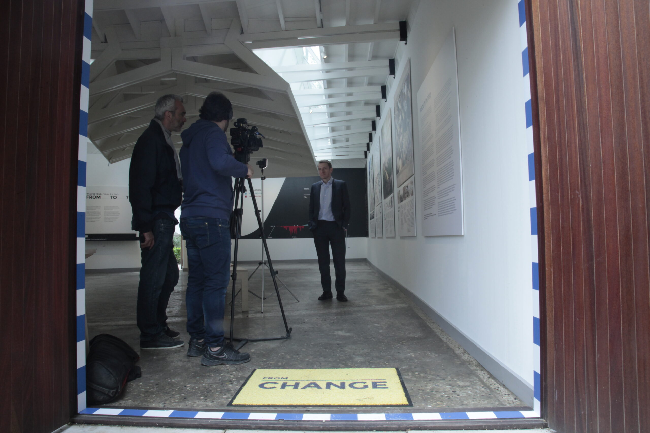
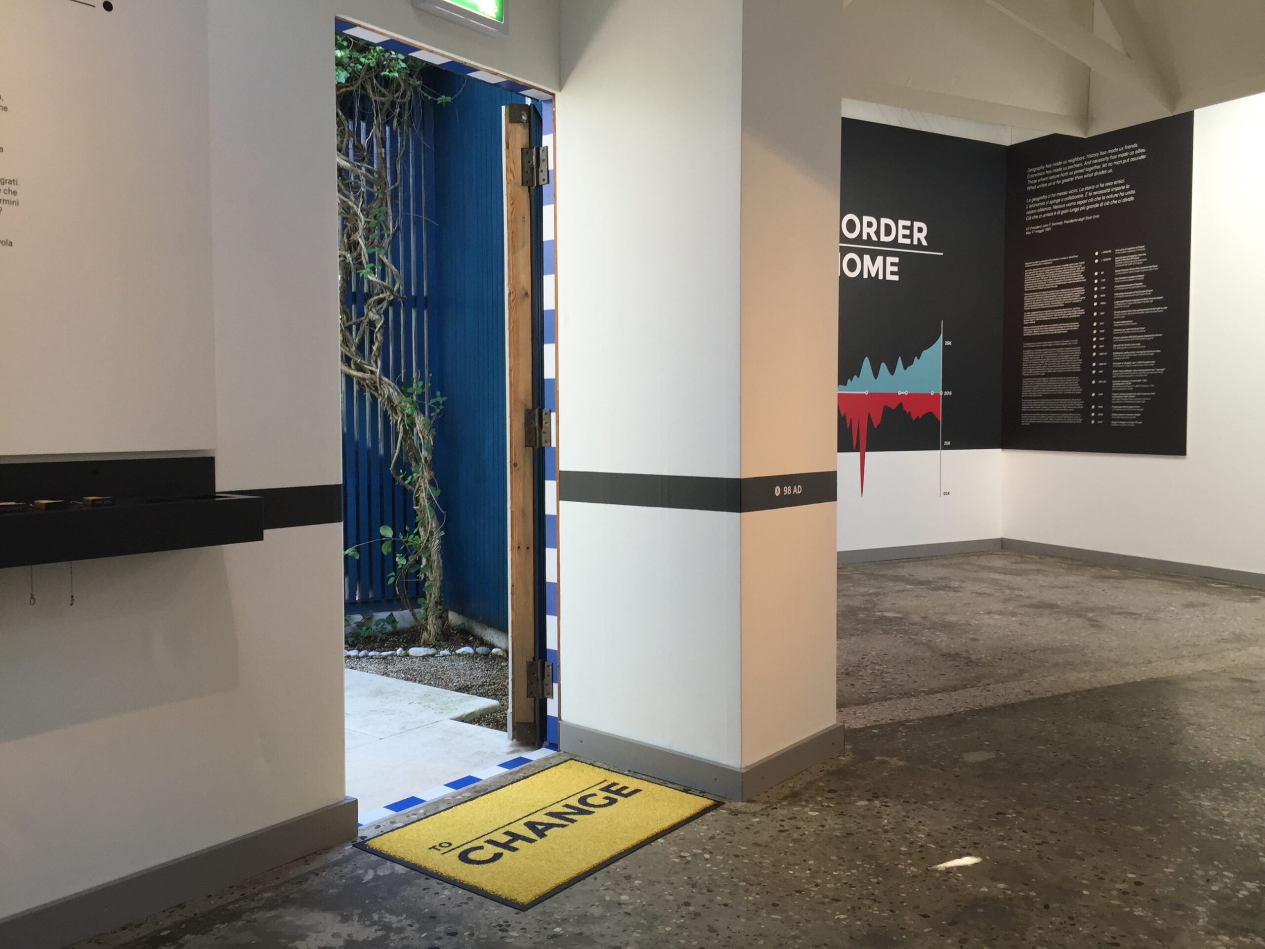
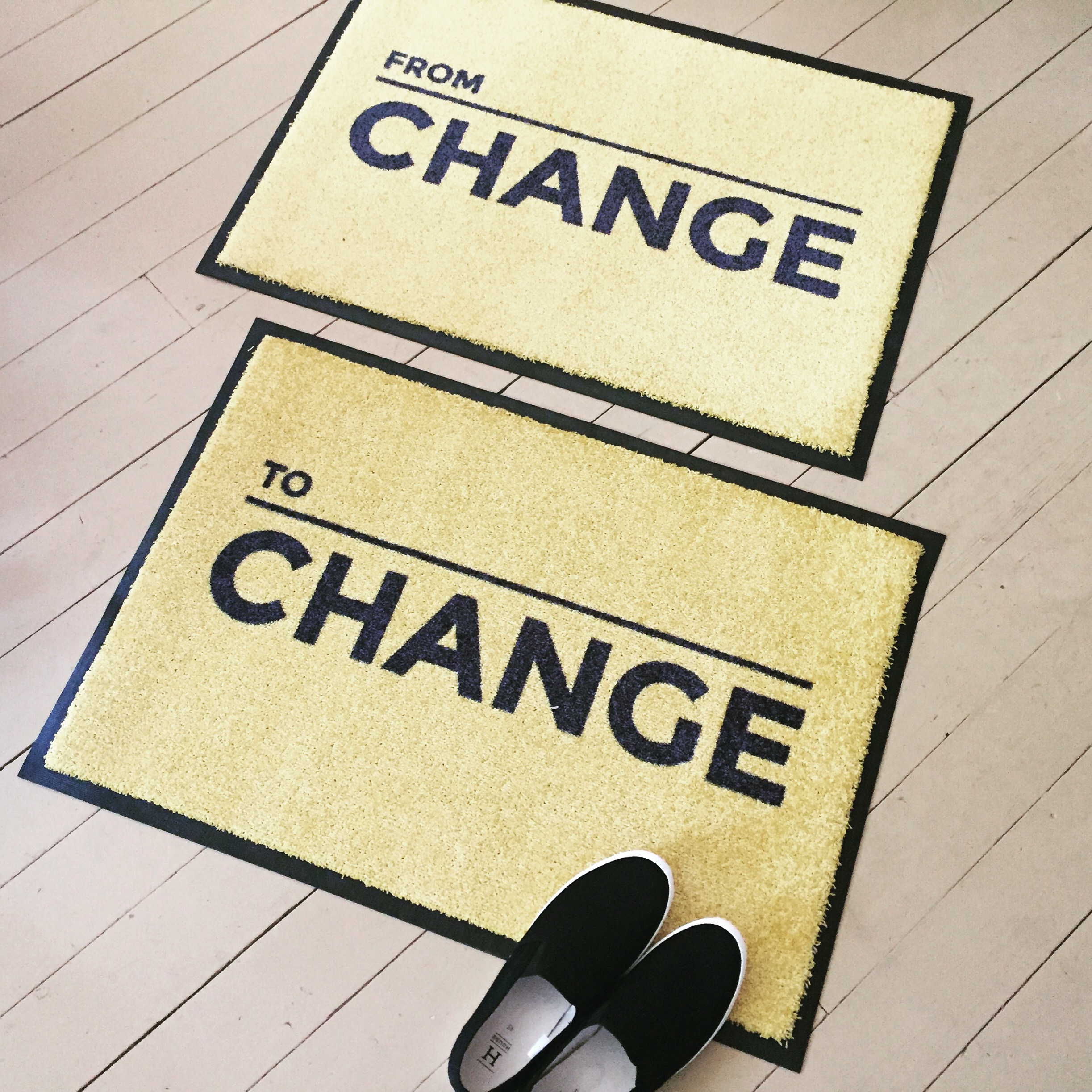
Since the stamp idea resonated with the whole team, I proposed that we make a set of real stamps for the visitors to choose from: to allow them to stamp their current “From-To” status on the exhibition booklet. Marco came up with an idea to use “welcome doormats” at the entry and exit of the exhibition. Rather than the classic “Welcome”, we used the newly created template to provide the wording: From Change – To Change. With this, we had a few adaptations of the From-To concept and it looked understandable on paper. What was left was to see if it worked in practice.